Our
brand.
Welcome to an open platform where you will find everything you need regarding our identity. Have a look around or dive into one of the specific elements making Nordnet come alive as a brand.
The Brand.
Nordnet was born in 1996, from an idea as simple as it was revolutionary: To take trading out of bricks and mortar branches and offer it online, giving ordinary people the power to grow their savings on their own terms.
Through the years, we grew outside Sweden to help customers save better in Norway, Denmark and Finland. Living up to our name as a digital platform for all the Nordic countries.
We added derivatives, international markets, and built a fund supermarket. We launched a modern private banking offering, digital advisory services and were the first bank in the Nordics to take trading from desktop to mobile. We paved the way for flexibility and cost efficiency within pension savings, and created the unique investment community Shareville. The list goes on.
All this is accessed on a constantly evolving platform, where usability and simplicity is at the core. We are always transparent, with no hidden fees or complexities in the fine print. But first and foremost, everything we do, we do to drive better returns for our customers. We are as passionate about them as we are about our company or savings in general. Because what is good for our customers, is good for us.
We continue to challenge structures and enable growth, by building the best platform for savings and investments. Our founding principle of democratizing savings and investments drives us to this day.
And if there’s one thing we’ve learned, it’s this: becoming rich is not a goal in itself. It is about independence, security, realizing your dreams and taking control of your financial future.
Purpose.
Why we exist.
We democratize savings and investments.
Through innovation, simplicity and transparency, we challenge traditional structures, and give private savers access to the same information, tools and services as professional investors.
Aspiration.
Our vision.
Becoming the #1 choice for Nordic savers and investors.
To achieve this goal, we must always continue to challenge and innovate, keeping user-friendliness and customer satisfaction at the top of the agenda. We measure this in different dimensions – how satisfied our customers are with the experience we provide them, how well liked our brand is within our target groups, and in what pace our business is growing.
Brand promise.
What you can expect from us.
Building the best platform for savings & investments. Through leading UX, cutting-edge financial products, automated and inspiring customer journeys as well as passionate staff, we are building the best platform for savings and investments – enabling higher returns.
Values.
What we believe in.
1. Passion.
Nordnetters lean forward and walk the extra mile to inspire loyalty and satisfaction among colleagues and customers.
2. Simplicity.
We believe that easy-to-use products, straight to the point communication and modern ways of working create engagement and activity.
3. Transparency
By telling it like it is and being open externally as well as internally, we build trust and a sense of inclusion.
Take your savings to the next level.
Never settle for less. Always aim higher.
Regardless of interest or knowledge, it is our belief that aiming a little higher, always achieves better results. Ambition is a human driving force, and at Nordnet we have the coaches, the tools and the inspiration to take your savings upwards and onwards.
The basis of Nordnet’s brand communication concept “Level up”.
We create the conditions for our customers to grow their savings in both quality and scope. With lower fees, greater choice and inspiring tools, you get more for less. It doesn’t matter if you’re a new or old in the savings game, our products and services enable opportunities for growth that few others can offer. Regardless of wallet size or prior experience we’ll provide everything you need. With us you’ll be able to take your savings to the next level and reach your goals or dreams even faster.
Our logo.
Our logotype is the most important graphic element as its main function is to act as sender for all our activities and can always represent our brand on its own. It is developed to always strengthen the brand perception and provide a direct visual recognition.
Symbol.
Nordnet is about growth, helping people grow financially and making investments accessible. It’s easy, not complicated. Our symbol for growth is just as easy. It resembles a line graph curve forming the letter ”N”, short for ”Nordnet”.

Wordmark.
Nordnet
The wordmark is based on our typography, Nordnet, creating a strong identity DNA throughout all our communications.
Our wordmark is always used along with the symbol. Though it can be separated horizontally when the context allows to.
Logotype.
The logotype is the most important graphic element. It’s main function is to act as sender for all activities and should always be able to represent the brand on its own. It is developed to always strengthen the brand perception and provide a direct visual recognition.
Primary version
Used for all our communications as long as the word mark is legible.
Secondary version
Used for small surfaces or formats where legibility of the wordmark of our primary version is limited or the composition is strengthened by the secondary version.
Size and proportion.
The logotype and the symbol should in general be used in rather large sizes.
Minimum widths of the different versions of the logotype.

Placement of the logotype.
The logotype is allowed to be placed with great freedom in a layout. The free placement creates great opportunities and simplifies handling in relation to other elements, but it is essential that the logotype has sufficient free space towards other elements to not be misinterpreted as part of the sender.
When placing the logotype, manage the background image, title and any other texts. The logotype should always be positioned so that good contrast and generous clearance to other elements are achieved.
The logotype should always be placed along a layout grid in balance with other elements.
Typography.
Typography is a main element in our identity, used throughout all touch points. The role of typography for Nordnet is to clarify information in dense environments as well as to create distinct communication.
Nordnet Extra Bold
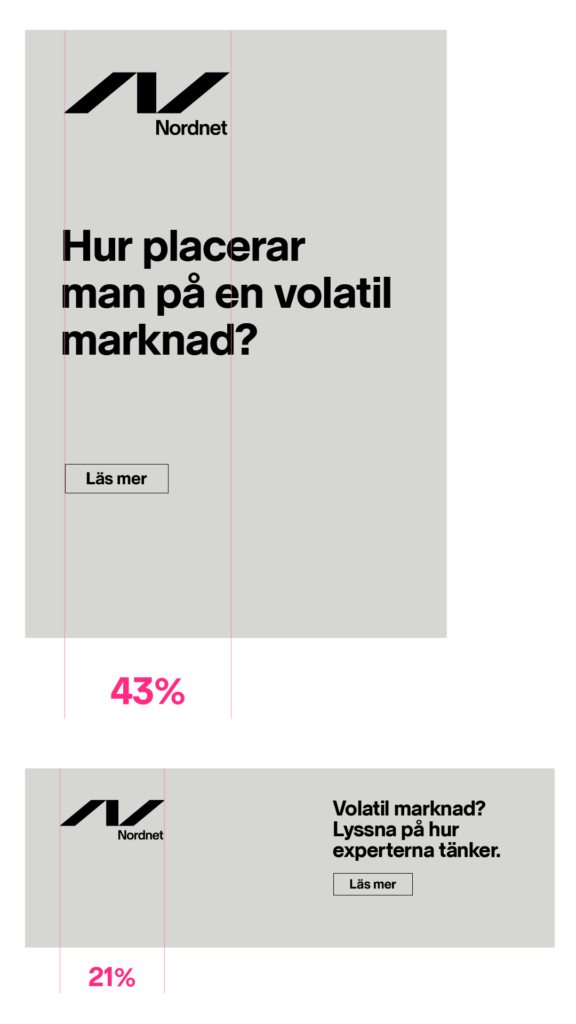
Nordnet Extra Bold is predominantly used for short headlines in external communication creating contrast, impact and vibrancy. Extra Bold headlines in advertising is an important part of stating and claiming that position. We also use Nordnet Extra Bold for sub headers in small sizes where great contrast is required for legibility.
Nordnet Bold
Nordnet Bold is used for headlines, subheadings and shorter texts for corporate and more formal communication. It is used where sophistication needs to be stressed and larger amounts of information require visual harmony, making it key in formal and corporate contexts.
Nordnet Regular
Nordnet Regular is our standard weight for body copy and UX interfaces.
Setting the line height.
Big headlines have a tight line height.
Big headlines: Don’t have a standard line height, instead they need to be set as tightly as possible, without letters touching between the lines.
Bold headlines for vibrant communication.
Smaller headlines: Are set with equal line height and font size – in this case 24/24 pt.
Body copy:
Example: Qui as moloressus. Ime nis dolupta tempor aut lignima gnihic te lat eos sum que di berum harchil id molorum rem as magniti busapit quamenet ommoloratis que el molore non rae es assequod moditi re iur anda net aute la qui sumquat iossimi ntiosam.
Check list.
- Always left aligned text.
- Always upper/lowercase. Not just capital letters.
- Work with as few sizes as possible on the same surface.
- Use punctuation in headlines.
- Same spacing as font size for small headers.
- All graphic elements should share the same colour in the layout.
- Big headlines should never be longer than maximum three lines.
- Use fewer font weights for greater consistency and compliance.
Examples.


Our colour world.
Our colour palette is wide for functionality, differentiation, recognition and contrast. The base is neutral and simple, consisting of white, grays and black to ensure a qualitative expression. Vibrant colours help us to be versatile and to create excitement, to highlight information and contrast the neutral base.
Our colours refer to creativity and energy and give us the opportunity to be functional, but also to communicate with our target groups and to adjust to different contexts and needs.
PMS Black 6C
HEX #000000
RGB 0, 0, 0
CMYK 0, 0, 0, 100
01
PMS Black 3C
HEX #282823
RGB 40, 40, 35
CMYK 69, 63, 68, 84
02
PMS Cool Gray 11C
HEX #4B4B46
RGB 75, 75, 70
CMYK 64, 57, 62, 40
03
PMS Cool Gray 9C
HEX #6E6E69
RGB 110, 110, 105
CMYK 57, 48, 52, 17
04
HEX #A0A09B
RGB 160, 160, 155
CMYK 40, 32, 36, 0
05
HEX #BCBCB6
RGB 188, 188, 182
CMYK 27, 21, 24, 0
06
HEX #D7D7D2
RGB 215, 215, 211
CMYK 15, 11, 14, 0
07
HEX #EBEBE8
RGB 235, 235, 232
CMYK 7, 5, 7, 0
08
PMS 3272C
PMS 3272U
HEX #00F0E1
RGB 0, 240, 225
CMYK
C: 100, 0, 50, 0
U: 100,0,50,0
01
PMS 213C
PMS 226U
HEX #FF2B83
RGB 255, 43, 131
CMYK
C: 0,100,12,0
U: 2,100,2,0
02
PMS 381C
PMS 388U
HEX #D2F500
RGB 195, 245, 0
CMYK
C: 22, 0, 100, 0
U: 15,0,100,0
03
PMS 901C
PMS 901U
HEX #00C8F5
RGB 0, 200, 245
CMYK
C: 100,1,9,0
U: 100,4,10,0
04
The grayscale gives us a high level of sophistication at the core of our brand – and differentiates Nordnet from other banks. Colour accents are added to enhance vibrancy and function and should mainly be used for communicative purposes.
The vibrant brand colours should be used as accents – with moderation, in an overall small proportion throughout the brand. Complementary colors seen below are for infographics when needed.
PMS 7474C
PMS 2231U
HEX #009195
RGB 0, 145, 149
PMS 3025C
PMS 308U
HEX #01424C
RGB 0, 66, 76
PMS 7635C
PMS 1935U
HEX #AC135A
RGB 172, 20, 90
PMS 235C
PMS 235U
HEX #78013A
RGB 120, 0, 60
PMS 7740C
PMS 2258U
HEX #3A913F
RGB 58, 145, 63
PMS 553C
PMS 2411U
HEX #023C00
RGB 2, 60, 0
PMS 7684C
PMS 287U
HEX #385E9D
RGB 56, 94, 157
PMS 2119C
PMS 280U
HEX #131F4F
RGB 19, 31, 79
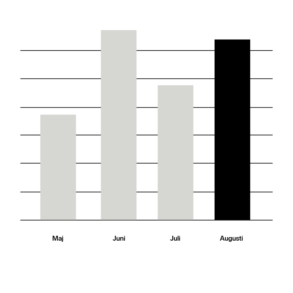
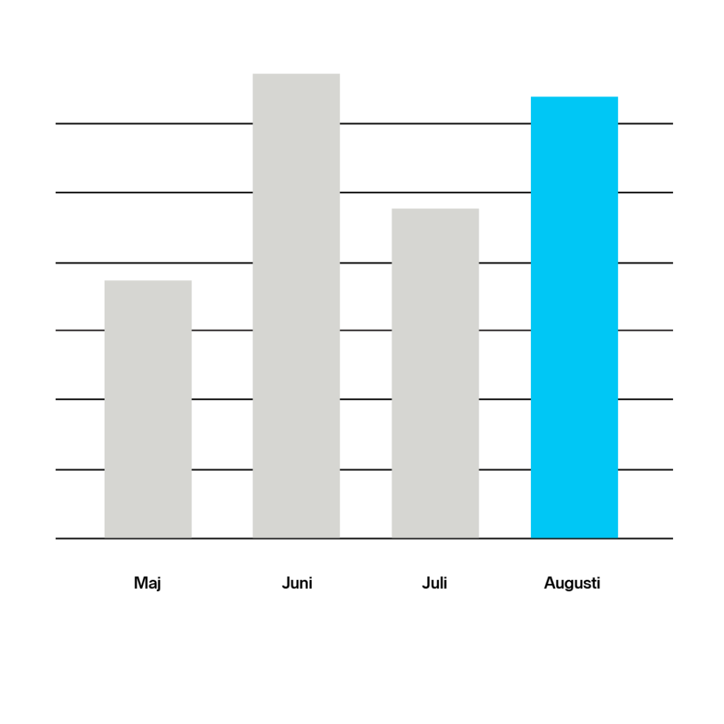
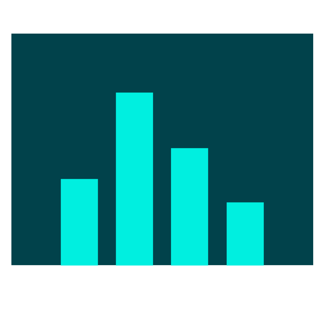
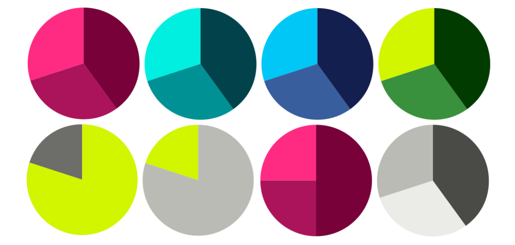
The complementary colours consists of muted tones used to created harmony and calm in infographics, and could be used to differentiate categories or similar. For occasions where several colours are needed such as in piecharts, the full Nordnet palette can be combined. Make sure that you work with one colour dimension at a time to create harmony, yet making sure the colours contrast each other for clarity.
Note! Always make sure to pick colours that don’t conflict with other colours in the specific context. For instance don’t mix the blue colour scheme with the pink colour scheme. Also make sure to adapt to context and create variation, so we’re not always using the same colour combination.
Our image tonality.
The image language is important to evoke emotion and tell stories that connects with our audience. The context of imagery, the function and purpose it fills should be put at center stage to ensure variety, quality and economy for future image projects.
Concept.
Our image tonality should reflect our vision, create awareness and represent our brand personality; being passionate, sophisticated, guided by simplicity, transparent and hi-tech. Our geographical position, Scandinavia, also shines through.
Our target groups are well informed, smart and aim high. That means our images needs to maintain high quality, authenticity and consistency at all times. A consistent image language creates a uniform and professional expression – which in turn leads to trust, higher recognition and builds a stronger brand.
Image types.
All images we work with will not be taken with the same purpose and end-use in mind. Some images should be in our image bank for a long time and work for several different departments they should be sufficiently universal to work with for a long time and be representative of our offer, our people and relevant topics. while others are more documentary or specifically corresponding to a temporary event.
Images should be sufficiently universal to work with for a long time and be representative of our offer, our people and relevant topics. Visit the Nordnet Image Bank here.
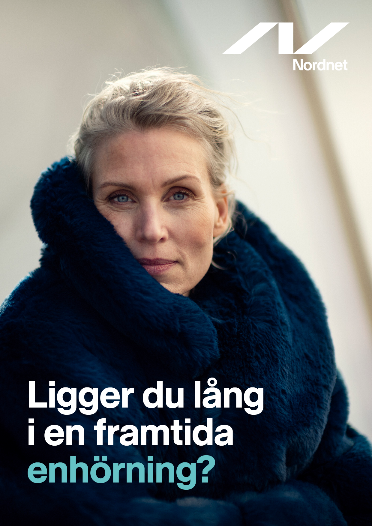
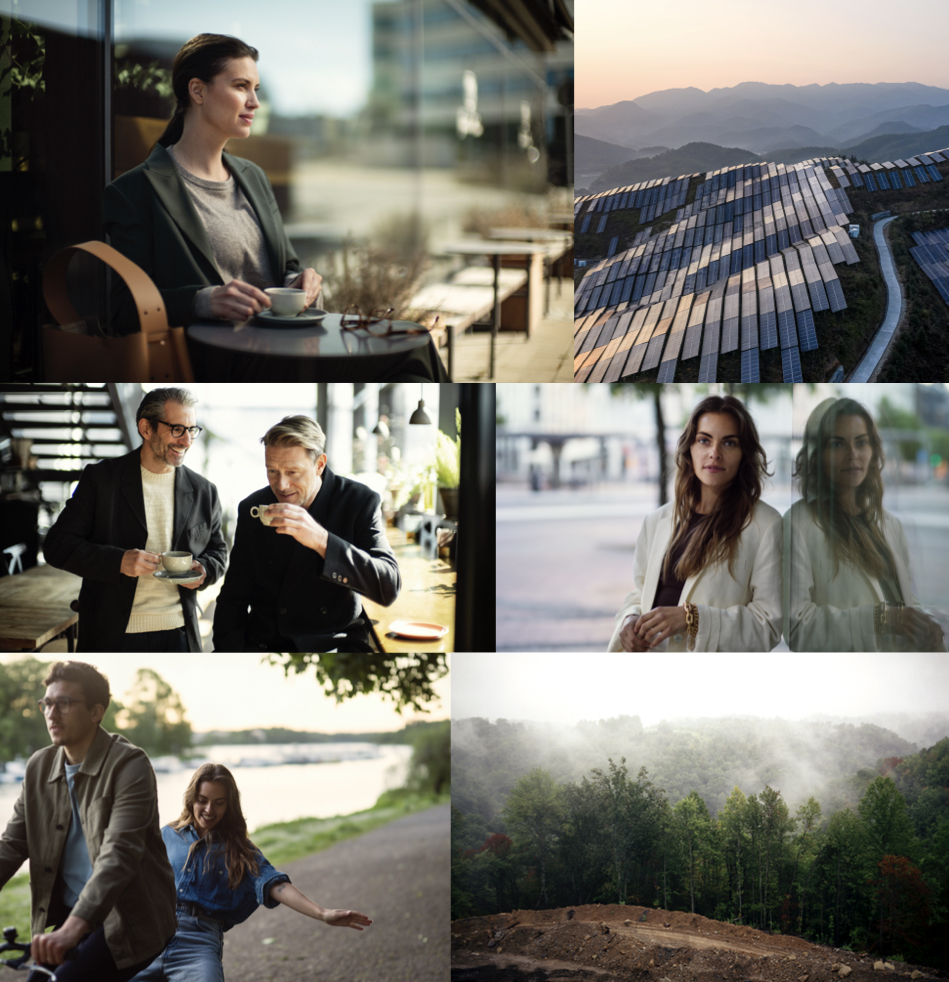
Portraits.
Images should be representative and sufficiently universal to work with for a long time.
Check list.
- People are portrayed in a context/environment and perceived as authentic and non-stereotypical.
- Short depth of field is used for portraits. This creates calmness, focus and areas to put graphics and text on.
- A feeling of “moments” or a personal meeting. Let a persons character and personality shine through.
- Even in stillness, people are experienced as active/ thinking.
- They are in a place where they thrive and express calmness, confidence, optimism and faith in the future.
- A calmness in colour scheme and surroundings are preferred.
We portray people with different backgrounds that reflect the society we live in, different ages and genders.
Platform and devices.
We work with advanced technology and knowledgeable employees. We want to present how our employees and our customers interact with our technology.
The same principles regarding tonality is important to apply when presenting our product. This category in particular need images to be unique, ownable and professional. Being ”to the point”, ”guided by simplicity” and ”sophisticated” is key to step outside clichés and we are proud to present features relevant to our customers.
Check list.
Proud and to-the-point, focus on the product by zooming in.
Simplistic and straight for clarity.
Representation and diversity are important.
Close-ups with devices need a short depth of field to make them interesting, functional but also to proudly focus on our platform.
Devices can be used in an environment as long as the context is aspirational and share the direction of our portrait and environment, topics and metaphors image
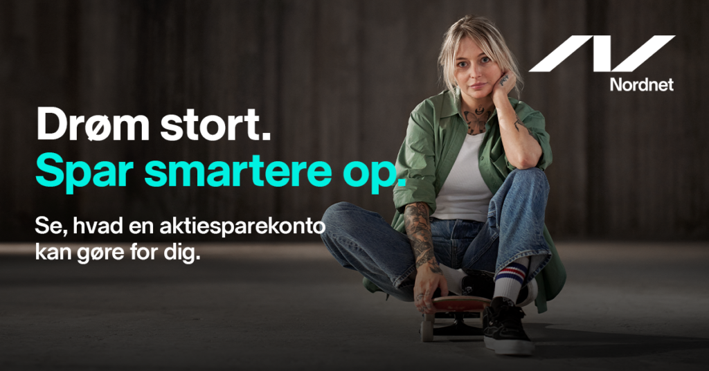
Environments/topics/metaphors.
A broad category that accommodate current topics, our products, represent an industry or act as a metaphor for a message. Such as growth or balance.
Check list.
When relevant, use people in these images as it adds a sense of scale, warmth and a human perspective.
When shooting photos, or choosing from stock image banks for this category, it may be relevant with a longer depth of field. But that puts even higher demands on the image to have calm areas.
Please keep in mind the need of flexible image sections, vertical and horisontal pruning.
Choose motifs that gives the audience instant, or short delay, understanding of the message. Do not over-complicate meaningsA
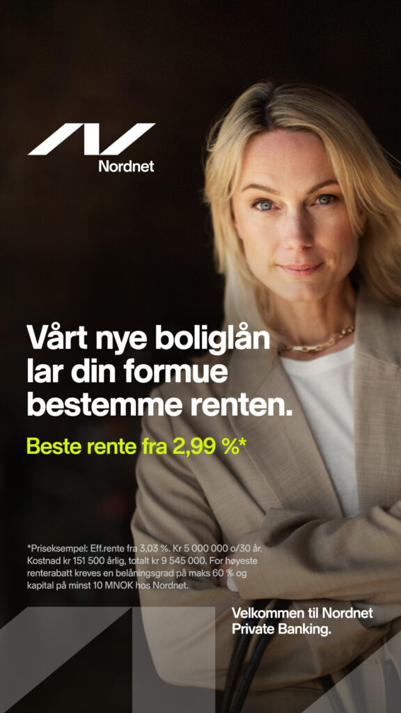
Savings economists.
Our Saving Economists are important external faces. They need to be presented in a professional way, in different situations and environments. Since these people are often seen in our communication, we need images of both colour and black/white in high quality to ensure variation and a successful representation for Nordnet.
Check list.
-
They represent the company and holds the role of a professional expert; therefore they need to be convincing, trustworthy and well dressed.
-
The person should preferably connect with the audience by looking into the camera or ”envision the future” by looking outwards.
-
A calmness in colour scheme and surroundings are preferred.
-
They should be photographed in different settings/situations, as well as in a studio, in colour and black/white. Variation and quality is key.
-
Let the character and personality of a person shine through, in a relevant way.
Documenting life at Nordnet.
Documentation images serve the sole purpose of describing the spirit, culture and events of Nordnet and should be used sparingly for external communication.
Check list.
Adopt a documentary approach, capturing the essence of the activity in an IRL way.
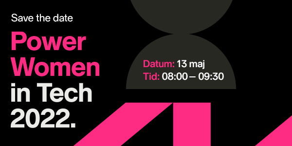
- When documenting events, such as Nordnet Live, flash can be used to create a more intense and energetic impression of the event.
- For occasions when we cannot control quality we may use black and white treatments to align with the overarching image language.
- PR imagery taken for documentary reasons to show a current action or happening at Nordnet should be taken in a relevant, authentic and truthful way. Keep composition simple and direct according to the same standards as all other Nordnet imagery.
- Use perspectives, angles, short depth of field and light to create calm backgrounds.
- Logotypes shouldn’t be used with the documentation images.
- Don’t use documentation images for visual brand building in channels such as our website, advertising, brochures, reception screens or external Powerpoint presentations. Hence don’t put text or logotypes on top of these images.
Our graphical world.
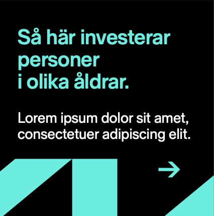
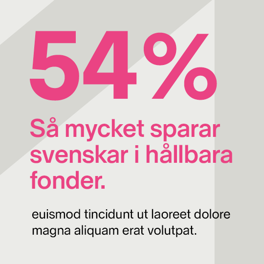
For occasions where we need to explain and clarify issues of abstract nature or difficult subjects where photography may feel too specific or too generic, we have developed a number of graphical tools based on basic geometric shapes: the line, the rectangle, the square and the circle – as well as arrows. Timeless shapes that provide us with endless variation and areas of use. Keeping the graphics this simple throughout the entire brand experience creates a holistic expression, from infographics to dynamic animated communication.
To create even more recognition, impact and differentiation, crops of the symbol could be used as a defining branding device in our communications. For more information see guidelines and templates.
The basic elements.


Infographics.

Downloads.
Download print, web logos and colour codes here.
For depth information about usage of imagery, graphics, typo and all other assets see guidelines and templates available on the server.